Email remains one of the highest-ROI channels for lead generation, but most teams are leaving conversions on the table by sending people away from their inbox to fill out a form. What if the form was already there, waiting for them?
Embedding a form directly in an email sounds simple. The reality involves a few important technical decisions that can make or break your conversion rate. The core challenge is that most email clients handle HTML differently, meaning a form that works beautifully in one inbox can break completely in another.
This guide cuts through the confusion. You'll learn exactly how to embed a form in email the right way, whether you're working with a full interactive embed, a linked landing page approach, or a hybrid method that gets the best of both worlds. By the end of these steps, you'll have a working, conversion-optimized form strategy for your email campaigns that actually reaches your audience without broken layouts or dead-end links.
This guide is built for high-growth teams who want to capture leads faster, reduce friction, and stop losing qualified prospects to clunky multi-step redirects. Let's build something that converts.
Step 1: Understand Email Client Limitations Before You Build
Before you write a single line of HTML or drag a form field into place, you need to understand why native form embedding is so complicated. This isn't a quirk you can engineer around with clever CSS. It's a deliberate design decision made by the major email clients.
Gmail, Outlook, Yahoo Mail, and Apple Mail all strip or disable standard HTML <form> elements by design. The reason is security: interactive form elements inside email create a vector for phishing attacks and unauthorized data harvesting. So rather than trying to force a broken experience, the smart move is to choose the right approach for your audience from the start.
You have three viable paths:
AMP for Email: Google's AMP framework allows interactive components, including forms, to render directly inside Gmail, Yahoo Mail, and Mail.ru. It's the closest thing to a true embedded form experience, but it requires sender registration with Google and strict adherence to their guidelines.
Linked landing page with a form: You design the email to drive clicks to a dedicated, distraction-free landing page where the form lives. This is the most universally compatible approach and works across every email client without exception.
Image-based form simulation with a CTA link: You create a visual mockup of a form as an image, then link every element of that image to your landing page. It looks like an embedded form but functions as a highly clickable CTA. Surprisingly effective for click-through rates.
How do you choose? Pull up your email analytics and check your subscriber client distribution. Most email service providers (ESPs) report this under "email client breakdown" or "open environment." If the majority of your audience is on Gmail, AMP becomes worth the setup investment. If you're sending to a mixed enterprise audience with heavy Outlook usage, the linked landing page approach is your safest bet.
The most common pitfall at this stage is assuming your browser preview is representative of the real inbox experience. It isn't. A form that renders perfectly in Chrome has no bearing on what Outlook 2019 will do with it. Nail down your approach before you build, and you'll save yourself hours of debugging later.
Step 2: Build Your Form for Email Conversion
The form you build for an email campaign needs to be designed differently than a standard website form. Email-driven traffic arrives with a specific context and a short attention span. Every extra field you add is friction, and friction kills conversions.
The design principles here are simple: fewer fields, a single clear CTA, and a mobile-first layout. For most email campaigns, that means three fields maximum. Name, email address, and one qualifying question. That's it. If you need more information, collect it in a follow-up sequence after the initial conversion.
Building this in Orbit CRM's form builder takes minutes. Create a new form, select a clean single-column layout, and add your fields. The qualifying question is where Orbit CRM's intelligence comes in: you can set up conditional logic so that a respondent's answer automatically scores, tags, or routes the lead. A prospect who answers "We have a team of 50+" gets routed differently than someone who says "Just me." That routing happens automatically, without anyone on your team having to manually sort through submissions.
A few specific things to configure before you publish:
Field labels and placeholder text: Keep them short and action-oriented. "Your work email" outperforms "Email Address" in most contexts because it signals you're treating this as a professional exchange.
CTA button copy: Avoid generic labels like "Submit." Use something that reflects the value exchange: "Get My Demo," "Claim Your Spot," or "Send Me the Guide."
Mobile layout: In Orbit CRM's builder, preview the form in mobile view before publishing. Buttons should be at least 44px tall and easy to tap with a thumb. Input fields should auto-zoom correctly on iOS.
Once your form is configured, generate the shareable link and embed code from the Orbit CRM dashboard. You'll use the shareable link for your landing page URL and, if you're going with Method B or C in the next steps, as the destination for your CTA links.
Your success indicator here: the form loads in under two seconds on a mobile connection and has no more than three fields. If either condition isn't met, simplify before moving forward.
Step 3: Set Up Your Dedicated Form Landing Page
Here's a decision that significantly impacts your conversion rate: where does the form live after someone clicks your email CTA? Sending traffic to your homepage is a mistake. Your homepage has navigation, competing CTAs, and content designed for cold visitors. Email traffic is warm and primed. It deserves a dedicated destination.
A dedicated landing page removes every distraction between your subscriber and the form. No navigation menu, no blog links, no footer full of other offers. Just the form, a headline that reinforces the email's promise, and a brief value statement that gives them one more reason to complete it.
With Orbit CRM, you can publish your form as a standalone page directly from the dashboard. The URL is clean and shareable, and you can customize the page to match your email's branding: same color palette, same headline tone, same offer language. This visual continuity matters. When someone clicks through from your email and lands on a page that looks and sounds like a natural extension of what they just read, they're more likely to follow through. When the landing page feels disconnected, doubt creeps in and bounce rates climb.
Before you finalize your landing page URL, add UTM parameters. This is non-negotiable for any team that cares about attribution. A properly structured URL looks like this:
https://yourform.orbitforms.ai/your-form?utm_source=email&utm_medium=newsletter&utm_campaign=q3-lead-gen
With UTM parameters in place, every submission from that email campaign will be tagged correctly in Google Analytics and most CRM platforms, so you can trace the lead all the way from the email send to the closed deal.
One more trust signal worth adding: a branded short link or custom subdomain. A URL like forms.yourcompany.com/get-started builds more click confidence than a generic tracking URL. Most branded link tools let you set this up in a few minutes, and it pays dividends in click-through rate over time.
Step 4: Embed the Form Experience Inside Your Email
Now you're ready to bring the form into the email itself. Based on your audience research from Step 1, choose the method that matches your subscriber base and technical capacity.
Method A: AMP for Email
AMP for Email lets you render a fully interactive form directly inside Gmail, Yahoo Mail, and Mail.ru. When it works, it's the gold standard for reducing friction, because subscribers never have to leave their inbox.
The setup has real requirements. You need to register as an AMP for Email sender with Google through their developer program at developers.google.com/gmail/ampemail. Your email must be sent with both an AMP MIME part and a standard HTML fallback. Google reviews your domain and sending practices before approving you, so this isn't a same-day setup. Plan for a few days to a week for the registration process.
Once approved, your email HTML includes a <amp4email> section with the form component, and a standard <text/html> fallback for clients that don't support AMP. The fallback should link to your landing page so non-Gmail subscribers still get a clean experience.
Use AMP when your audience is primarily Gmail users and you have the technical resources to implement and maintain it.
Method B: Image + CTA Button
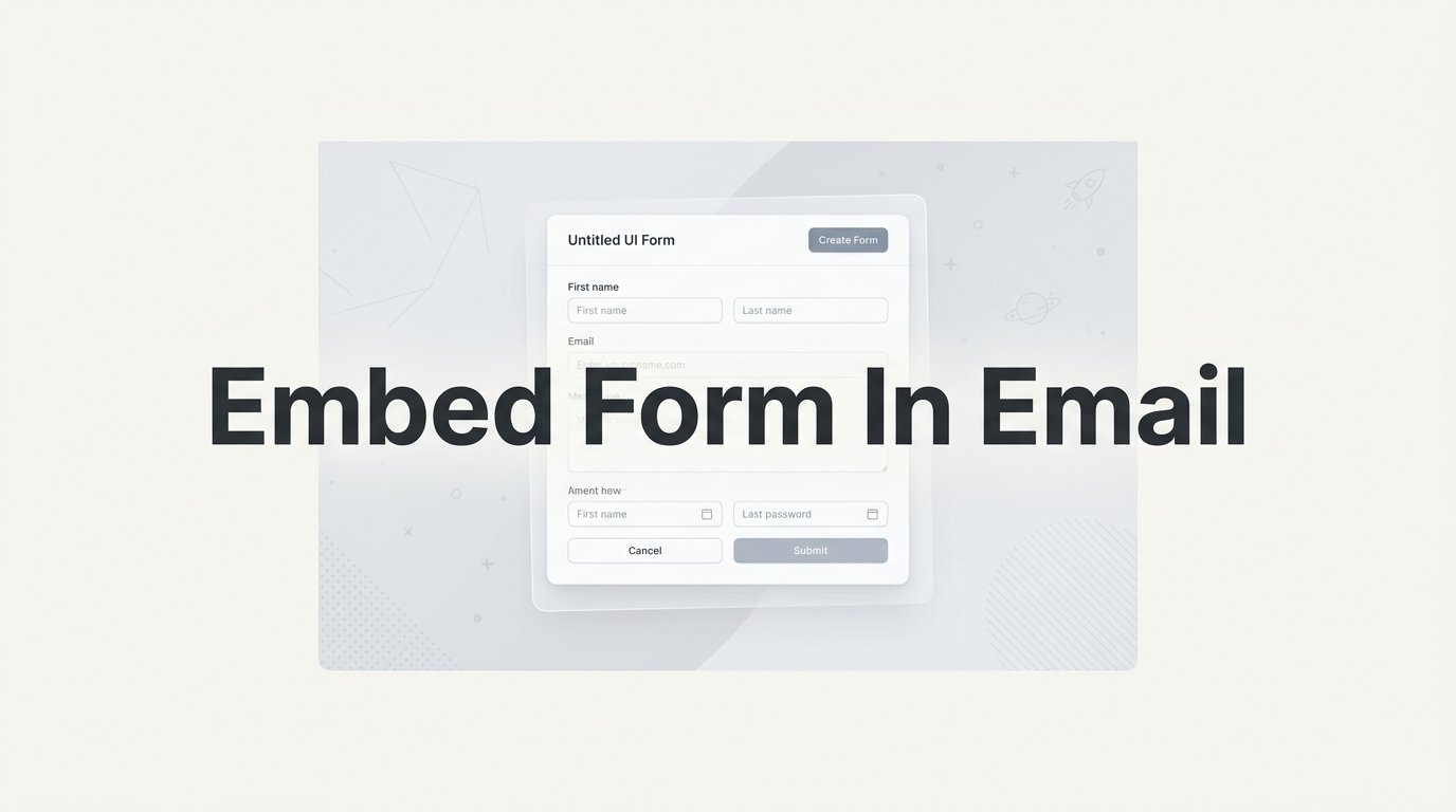
This is the highest-compatibility approach and often the most practical for teams without dedicated email developers. You design a visual mockup of your form as an image, showing the fields and button as they would appear if they were interactive. Then you link the entire image, and a separate CTA button below it, to your landing page.
The visual effect is compelling. Subscribers see what looks like a form right in their inbox, and clicking anywhere on it takes them directly to the real form on your landing page. Because it's an image with a hyperlink, it renders correctly in every email client, including Outlook.
Make sure your image has alt text that communicates the action: "Click to complete your registration" or "Fill out the form to get started." This covers subscribers who have images disabled.
Method C: Inline HTML Snippet
For simple single-field captures, like collecting just an email address, you can embed a basic HTML input and button directly in your email HTML. Some email clients will render this as a functional field. For those that don't, your fallback is a clearly visible CTA link that goes to the landing page.
Structure your HTML so the fallback is a natural part of the layout, not an afterthought. A sentence like "Prefer to sign up directly? Click here to access the form" keeps the experience clean regardless of what the client renders.
The method selection logic is straightforward: AMP for tech-savvy B2B audiences on Gmail; image plus CTA for the broadest reach across mixed client environments; HTML snippet for simple single-field captures where you want to test inline interaction.
Step 5: Test Across Email Clients and Devices
Testing is where most teams cut corners, and it's where campaigns fail. An email that looks perfect in your own Gmail account can be completely broken in Outlook 2019 or on a Samsung native mail app. You need to test systematically before you send to your full list.
Your non-negotiable test matrix should cover: Gmail on web and mobile, Outlook 2019 and Outlook 365, Apple Mail on desktop and iOS, and at least one Android native mail client. This covers the large majority of real-world email environments your subscribers are likely using.
The most efficient way to run this matrix is with an email preview tool. Litmus and Email on Acid both render screenshots of your email across dozens of clients simultaneously, without requiring you to maintain accounts on each platform. Send your test email to the tool, and within a few minutes you'll see exactly how it renders in each environment. These tools are worth the investment for any team running regular email campaigns.
For each client in your matrix, verify these specific things:
Form link functionality: Click every CTA, button, and linked image to confirm they resolve to the correct landing page URL with UTM parameters intact.
Mobile tap targets: On mobile previews, confirm your CTA button is large enough to tap comfortably. A button that's easy to click with a mouse can be frustratingly small on a phone screen.
Fallback content display: In clients that strip interactive elements, confirm your fallback link or image is visible and clearly actionable.
Image rendering: If you're using Method B, confirm your form mockup image loads and displays correctly, including in clients with images blocked by default.
After your tool-based testing, send the email to yourself and two or three colleagues using different email clients. Real-device testing catches things that automated preview tools occasionally miss, particularly around interactive behavior on mobile.
Common quick fixes: if your CTA button is too small on mobile, increase padding rather than font size. If images aren't loading in Outlook, check that your image is hosted on a publicly accessible URL, not a local file path. If UTM parameters are dropping, double-check that your URL isn't being modified by your ESP's link tracking settings.
Step 6: Connect Form Submissions to Your Lead Workflow
A form submission that sits in a spreadsheet for 24 hours before anyone sees it is a missed opportunity. Lead response time matters. The faster your team follows up, the higher your chances of converting that interest into a conversation.
Start by setting up instant submission notifications in Orbit CRM. You can configure alerts that fire the moment a form is submitted, routing to the right person on your team based on the lead's responses. If your qualifying question identifies enterprise prospects, those submissions can notify your enterprise sales rep directly rather than going to a general inbox.
Next, connect Orbit CRM to your CRM and marketing stack. Orbit CRM supports native integrations with major CRM platforms, and for tools not covered natively, Zapier handles the connection. The goal is that every form submission creates or updates a contact record automatically, with the form responses mapped to the correct fields. No manual data entry, no copy-pasting from email notifications.
This is where lead qualification logic pays off. In Step 2, you set up qualification rules based on form responses. Now those rules need to translate into CRM actions: auto-tagging leads by segment, assigning a lead score, routing to the correct pipeline stage, or triggering a specific sales sequence. Configure these mappings in your CRM so the automation does the heavy lifting.
Finally, set up a confirmation email sequence that triggers immediately after submission. This serves two purposes: it confirms to the lead that their submission was received, and it begins your nurture sequence while their interest is highest. The first email in the sequence should deliver whatever you promised in the original email campaign, whether that's a guide, a demo booking link, or a personalized follow-up.
Your success indicator for this step: within five minutes of a test submission, the lead appears in your CRM with correct tags, the right pipeline stage, and a follow-up sequence is triggered. Run this test before you launch the campaign. If anything in the chain doesn't fire correctly, find it now rather than after your list has submitted.
Step 7: Track Performance and Optimize for More Conversions
Once your campaign is live, three metrics tell you everything you need to know about whether your embed-form-in-email strategy is working.
Email click-through rate to form: This measures how compelling your email is. If people are opening but not clicking, your CTA copy, button placement, or offer isn't landing. This is an email problem, not a form problem.
Form completion rate: This measures how well your form converts the traffic it receives. If people are clicking through but abandoning the form, you have too many fields, the wrong qualifying question, or a visual disconnect between the email and the landing page.
Lead quality score: This measures whether the leads you're capturing are actually worth capturing. If your form is generating high volume but low-quality submissions, revisit your qualifying question. It may not be filtering effectively.
Orbit CRM's analytics dashboard shows you where drop-offs happen within the form itself. If a specific field has a high abandonment rate, that field is the problem. Either remove it, reword it, or move it to a later step in the sequence.
For improving click-through rate, A/B test your email CTA copy and button placement. Test one variable at a time: button color, CTA text, position in the email (above versus below the fold). Give each test enough sends to reach statistical significance before drawing conclusions.
For improving form completion rate, test field order and question phrasing. Sometimes moving the email field to the top increases completion because it's the easiest field to fill in first. Sometimes rephrasing a qualifying question from a direct ask to a multiple-choice format reduces friction significantly.
The diagnostic logic is straightforward: low completion rate means the form has too many fields or the wrong questions. Low click-through rate means the email copy or CTA needs work. Both low means revisit the offer itself. Use the data to direct your iteration, and you'll improve with every send.
Your Complete Email Form Workflow: What to Do Next
Here's your quick-reference checklist for the full workflow:
1. Audit your subscriber email client distribution and choose your embedding approach (AMP, image+CTA, or HTML snippet).
2. Build a minimal, mobile-optimized form in Orbit CRM with no more than three fields and one qualifying question.
3. Publish the form to a dedicated landing page with visual continuity to your email and UTM parameters in the URL.
4. Implement your chosen embedding method in your email HTML, with a working fallback for unsupported clients.
5. Test across your full client matrix using a preview tool, then send a live test to real devices before launch.
6. Connect form submissions to your CRM and configure instant notifications, lead routing, and a triggered confirmation sequence.
7. Track click-through rate, form completion rate, and lead quality score. Iterate on email copy and form fields based on the data.
The fastest path to better email conversions is a form that's built for it from the ground up: minimal fields, smart qualification logic, and a seamless experience from inbox to submission. Every step in this guide compounds. A well-built form on a dedicated landing page with proper UTM tracking and CRM integration will outperform a hastily embedded form every time.
Transform your lead generation with AI-powered forms that qualify prospects automatically while delivering the modern, conversion-optimized experience your high-growth team needs. Book a demo and see how intelligent form design can elevate your conversion strategy.